
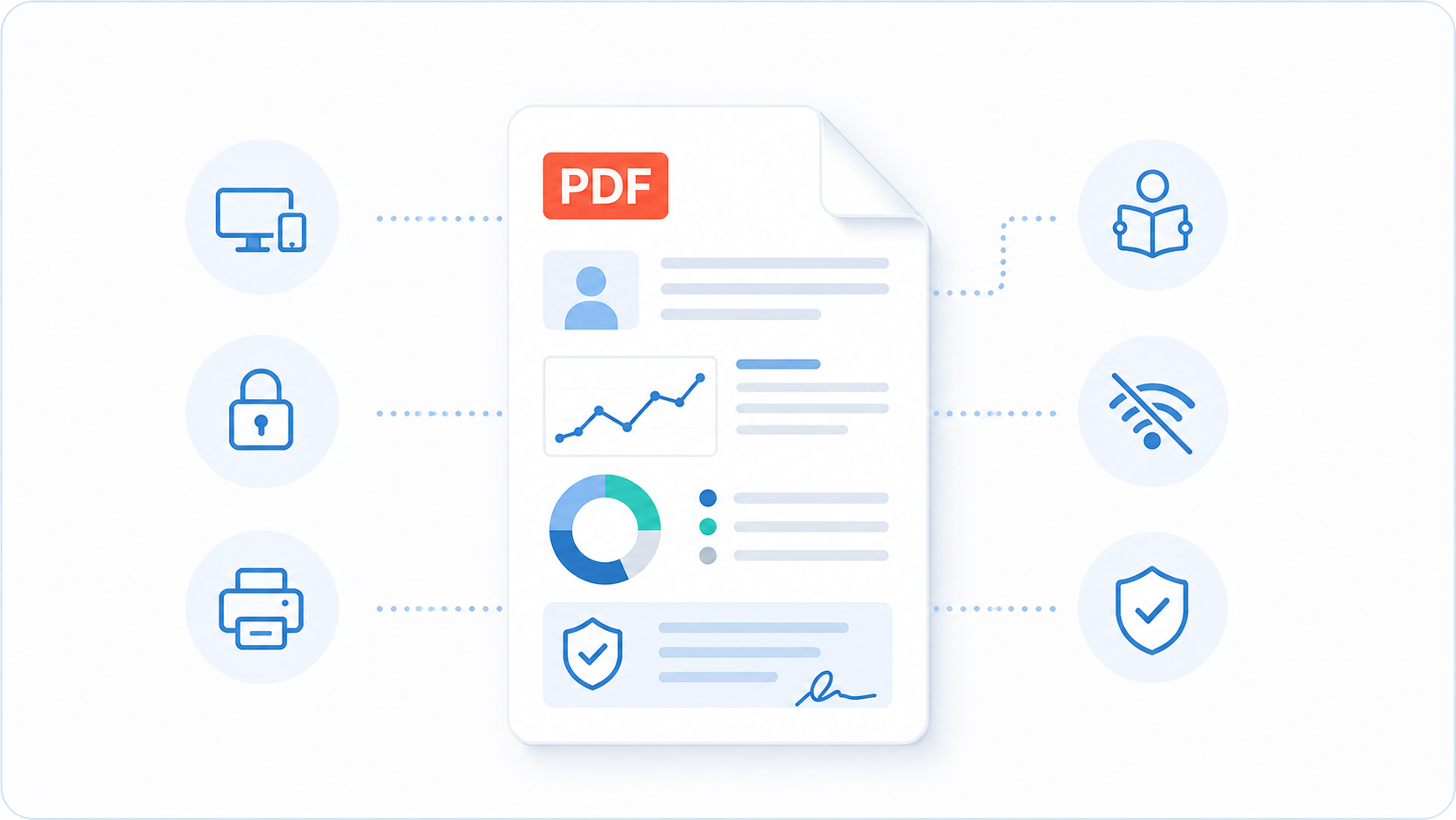
Somewhere in every reporting decision sits a question nobody spends much time on: what format should the report actually use? It's easy to treat that as a technical footnote — PDF, web page, Word document, plain email — when in practice it decides how the report looks, how long it survives, and how much a patient can trust it.
Dashboards and portals are having a moment in health tech. Every result "lives" in an account, updated in real time, accessible from any device. That's a genuinely useful pattern for ongoing monitoring. But for the health checkup report — the document a patient receives once, keeps, and refers back to for years — PDF remains the better format. Not because it's familiar, but because it does the job a permanent health record actually needs to do.
It looks exactly the same, on every device, every time
A PDF is a fixed-layout document. What you design is what the patient sees — the same fonts, colours, and position of every chart and callout box — whether they open it on an iPhone, an old Android tablet, a work laptop, or print it on paper.
A web page cannot make that promise. Responsive layouts reflow content depending on screen width, browser, and installed fonts; a chart that sits neatly beside a result on a desktop can end up stacked awkwardly, or cropped, on a phone. For a document meant to reassure a patient at a vulnerable moment, unpredictable rendering is a real cost.
It's designed for careful reading
A well-designed PDF creates a deliberate reading path: overview first, key deviations next, explanations and recommendations after that. This is valuable for complex health information, where uncontrolled scrolling and interface distractions can weaken comprehension.
Most patients now reach for their phone first, out of habit, and expect to scroll quickly without reading closely. A PDF works against that instinct rather than accommodating it — and that's the point. It slows the moment down. There's no infinite feed to scroll past, no next notification pulling attention away mid-result. The patient turns a page rather than flicking past one, which gives a genuinely important piece of health information the deliberate, undistracted attention it needs, even on the same device where everything else is designed for quick, shallow scrolling.
It works even without a smartphone or internet
Portal-based reporting sounds modern until a patient has to remember a password to see health data they will look at twice a year. Every login screen is a point of drop-off — and for older patients, or anyone unfamiliar with the clinic's particular portal, it is often the point where they give up and call the front desk instead.
A PDF, once delivered, needs nothing else. It opens offline, on a plane, at a kitchen table with no wifi, five years from now on a laptop long since disconnected from whatever system generated it. It does not depend on your servers staying online, a subscription staying active, or a login page still existing.
It can be locked, so nobody can quietly change what it says
A PDF can be locked so that editing is password protected. Anyone can still open and read the report, but no one can retype a result, delete a recommendation, or alter a value without it being obvious that the file has been tampered with.
That matters for a document that may end up forwarded to another clinician or printed and filed. It is what lets a lab, a referring physician, or an auditor treat the file as the authoritative version — not something that might have been quietly edited after the patient first saw it.
A web page offers no equivalent guarantee. Content behind a login can be updated at any time by anyone with admin access, and the patient's original copy carries no proof that it hasn't changed.
It prints the way it was designed to print
Not every patient wants a digital-only result. Many will print the report to bring to another appointment, file at home, or share with family members.
A PDF prints exactly as it was designed, page by page, with every chart and colour intact. A web page does not: browser print functions routinely cut off content, break page boundaries mid-section, or strip the visual design that made the report clear in the first place. If a report has to hold up in ink as well as on-screen, it needs to be built for both — and PDF already is.
It feels like a finished, professional document
A well-designed PDF carries a certain formality that a web page rarely does. For premium health and wellness services, that tangibility matters: a finished, downloadable document reads as a completed, professional assessment — not a page that simply happens to be live right now. That impression shapes how seriously a patient takes the results and recommendations, and how much value they associate with the service behind them.
It isn't really competing with paper — it's competing with a link that can expire
The honest alternative to PDF today is rarely a paper printout — it's a secure portal link. Portals have real advantages for ongoing data, such as trend lines and repeat panels. But as the vehicle for a single completed report, they introduce problems PDF doesn't have: links expire or get revoked, hosting patient data behind a URL adds a security and compliance surface a static file doesn't, and every portal is one more piece of infrastructure a clinic has to keep running, patched, and staffed.
None of that makes portals wrong — it makes them a different tool, for a different job. The completed report is better served by a file the patient owns outright.
It doesn't require a dedicated app
Apps make sense for services people return to often. A health checkup report isn't that — most patients receive it once or twice a year, which is rarely enough to justify a permanent place on their phone. A PDF fits that usage pattern more naturally: no install, no account, no app to keep or eventually delete.
There's also the setting a report opens into. Apps live alongside notifications, social feeds, and everyday tools competing for the same screen, which isn't the ideal context for a document meant to be read carefully. A PDF opens on its own, holds the reader's attention, and asks for nothing beyond the file itself — no account created, no permissions granted, no data collected beyond the moment of delivery. For a report a patient keeps and refers back to, that simplicity is the more professional fit.
How LabToWellness addresses this
LabToWellness is built around exactly this checklist. Every report our platform generates applies consistent visual hierarchy, plain-language explanations, and personalised recommendations — across laboratory results, physical measurements, and questionnaire data — without manual assembly.
A focused 20-minute call — you'll leave with a clear picture of what's possible.
Or browse example report designs first
Browse report designs →